Home
Home

 Artists
 Search
 Recent
 Random
 Posts
Posts
 DMs
DMs
 Tags
Tags
 Random
 Importer
 Import
 FAQ
FAQ
 Account
 Register
 Favorites
 Login
Login

Charity Case Ch3:Pg29 Process & hi-res (Patreon)
Content
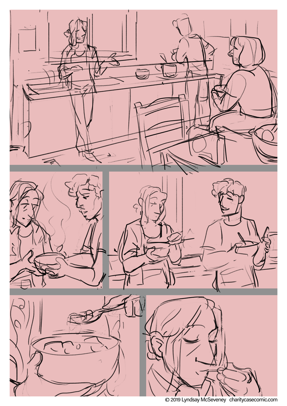
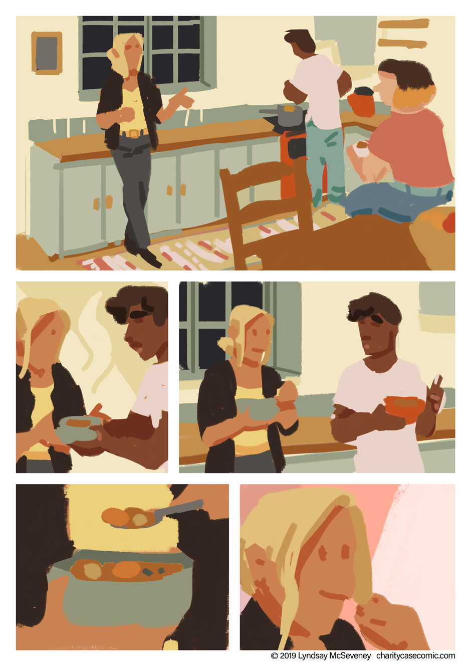
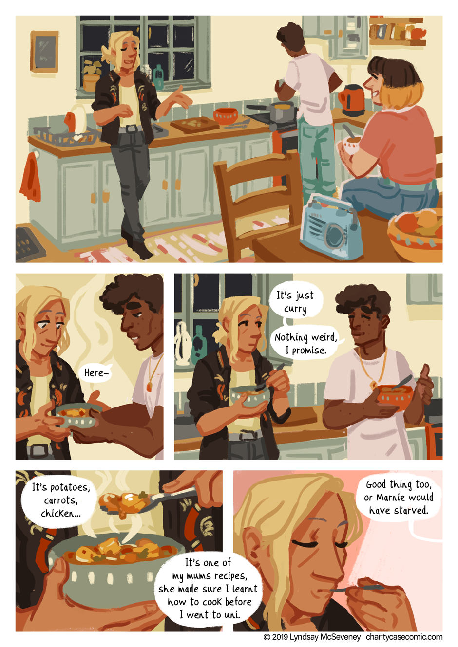
I majorly struggled to sort out the colours on this page! Canonically, the kitchen is olive green, and it's appeared in maybe 2-3 panels in the past, but it looked *so* ugly that I actually had to change it to a less jarring colour. It looks good as a stand-alone concept, but adding the characters in made the warm skin tones clash with the green, and the pink and mints in roman and marnies outfits really look bad :S. I decided on a blue because blue/yellow/orange/red is a really solid combo, and it pretty much covered their outfit colours without too many outliers that clashed!
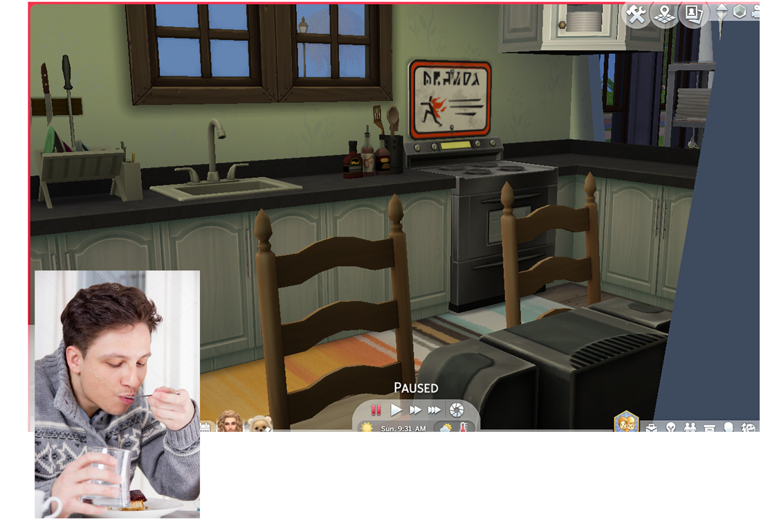
I also basically traced that sims screenshot- a choice which kinda bit me in the foot, because the perspective is? questionably warped? Haha. Roman is very small over there but alas, time constraints.
Files