Home Artists Posts Import Register

Content

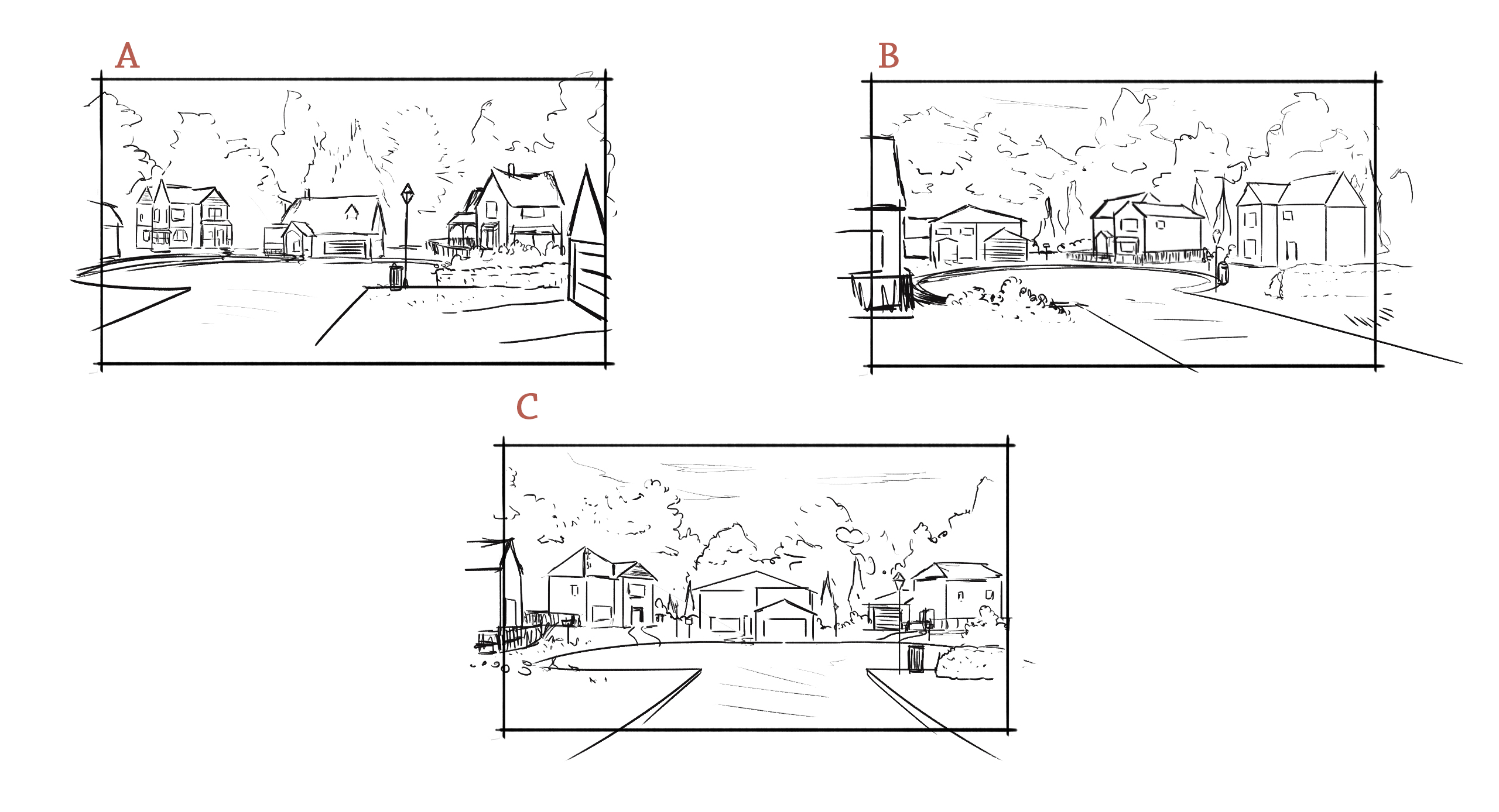
This is an old design option sketch. With Our Life: Now & Forever, most of the backgrounds start with multiple options for the perspective/content of the location. I pick the one that fits best or sometimes aspects of multiple BGs are combined together to form a new composition.

I've shared a few of the design sketches in the past, but since OL2 is the main project in development I think now's a good time to start making that a more regular thing. It's an extra part of the development process that I can only really share on the Patreon since I don't post non-game assets on the public socials.

So, here are the options the artist had come up with for the main cul-de-sac BG back when the game was in early development! We've already seen the finished version in the demo/beta.

Files

Comments

Nullenara

I really like A and C!

Lívia

i like A and C!!!

Aaron Ladd

Really love b and c!

Karra

Agreed, A and C looks amazing!

Maideen Fair

C is my favorite, perhaps because that's thr design im used to, but A is really great too!

Chloris_Chris

I gotta say A and C does stands out in the three options there 👀 or maybe we could see all three of them when the MC walks home with either Tamarack or Qiu or all the other characters ? (just a little my own thoughts here🥺)

KatieOnToast

I seem to be the minority looking at everyone else, but I'm all about B

Bobcatll G

i really like option A. But C look amazing too

jay

i love them all, but i like b the most in my opinion

Ru'er

A! The perspective is neat while still keeping all three houses in view.

sadomasovix

I think A and C look the best!

Cheese-And-Rice, Mooney

I guess A or C are the one I prefer, with C being the one I like the most. I'm assuming they are the visual of when you walk there and I think A and B are meant to look like walking to the side of the road and C as if you are walking in the middle (at least that's how I see it) and I think that A would look better as the side of the road we walk on. C I like it both because I'm used to it by now and because it's nice to see the visual matching the road leading to the house and being able to actually see the houses from afar. They would definetely work well if there was the option to chose where to walk (if on the left/right side of the road or middle) but they are meant to be one consistent photo for the whole game so obviously it won't happen XD Anyway, A or C are my favorite.

leogrl19

It's so funny: I was under the impression there were no other houses *except* MC's, Qiu's and Tamarack's. Like it was this cul-de-sac of 3 houses surrounded by forest that just - led out to the main town road. The end. lol (Maybe new houses would be developed later) So these different perspectives are lovely - really like A & B since they give that extra bit more of neighboring content!

Avon_nene

I really like how option B looks :D

Cheese-And-Rice, Mooney

Honestly I thought the same XD This clearly look as if you are walking either in the middle of the road or at the side of the road so it would be cool if you can choose which side take but obviously the scenario is important and they need to keep it constant, making a option where you can choose which side to walk on would probably require too much work and in the end it's not that important for the story, but it would have been cool for sure.

themidnighttiger

B is unique and my personal favorite! But A would probably be more acceptable for the game tbh

Sami

Agreed! A and C! :)

Anthony D Crowley

I'd say personally I most like option A, It invokes a certain feeling. I can't say what exactly but I feel like I've been there before, maybe it is indeed nostalgia? ;)

sannysan

i’m really love option C! feels like it give more detail to the neighborhood😭

Jack Guy

I personally like the extra detail of option C

Generic_AC

I really like B, it feels more immersive

Lonely_Mermaid

Oh, that's so cool! Personally, I like B more

Ruby

def prefer B

Ashley Owens

I really love C, but B also looks nice

Stian Å.

I like B the most, by some margin. If I'm being honest, I'm not much of a fan of how A spaces out the buildings. It feels a bit... stilted, that makes sense. Nothing against C though, but I do still prefer B. Guess I'm in the minority though ehe.

Kit (edited)

Comment edits

2023-05-29 04:48:56 The one that jumped out at me was B
2023-05-28 20:12:46 The one that jumped out at me was B

The one that jumped out at me was B

ian

super cool :)

Lea

I like B the most see a close second. I feel like A feels a bit stiff.

Ally

C!!!

Stich Warren

I love C becuz you get to see the whole circle

rolilol

I think a looks nice:)

Triscuits

for me, i love c because it reminds me of the cul de sac i used to live in a long time ago. i also think b would work as well.

WhispWar

B 1st place, C in second.

ItaLii

Ooh, I have to say I do love the final product the most. You picked the best one imo I just love seeing it straight ahead

gbpatch

Glad you like them, but these are just concept sketches I'm sharing as bonus content. The finished BG is already done, and none of the other options will become actual BGs in-game. I'm sorry.

Konoi Kurozora

It's interesting. As pictures, I think I like A and B more than C because well, the composition is pretty. But the final version is very good as it shows all three houses.

Suki Williams

B and C are my favorites! But you can't go wrong, they are all amazing.

Althana

A is my preferential one with B coming in a close second.

SRM Tree

I'm pretty fond of B myself.

killjinx

i love A