Home
Home

 Artists
 Search
 Recent
 Random
 Posts
Posts
 DMs
DMs
 Tags
Tags
 Random
 Importer
 Import
 FAQ
FAQ
 Account
 Register
 Favorites
 Login
Login

Logo feedback requested (Patreon)
Content
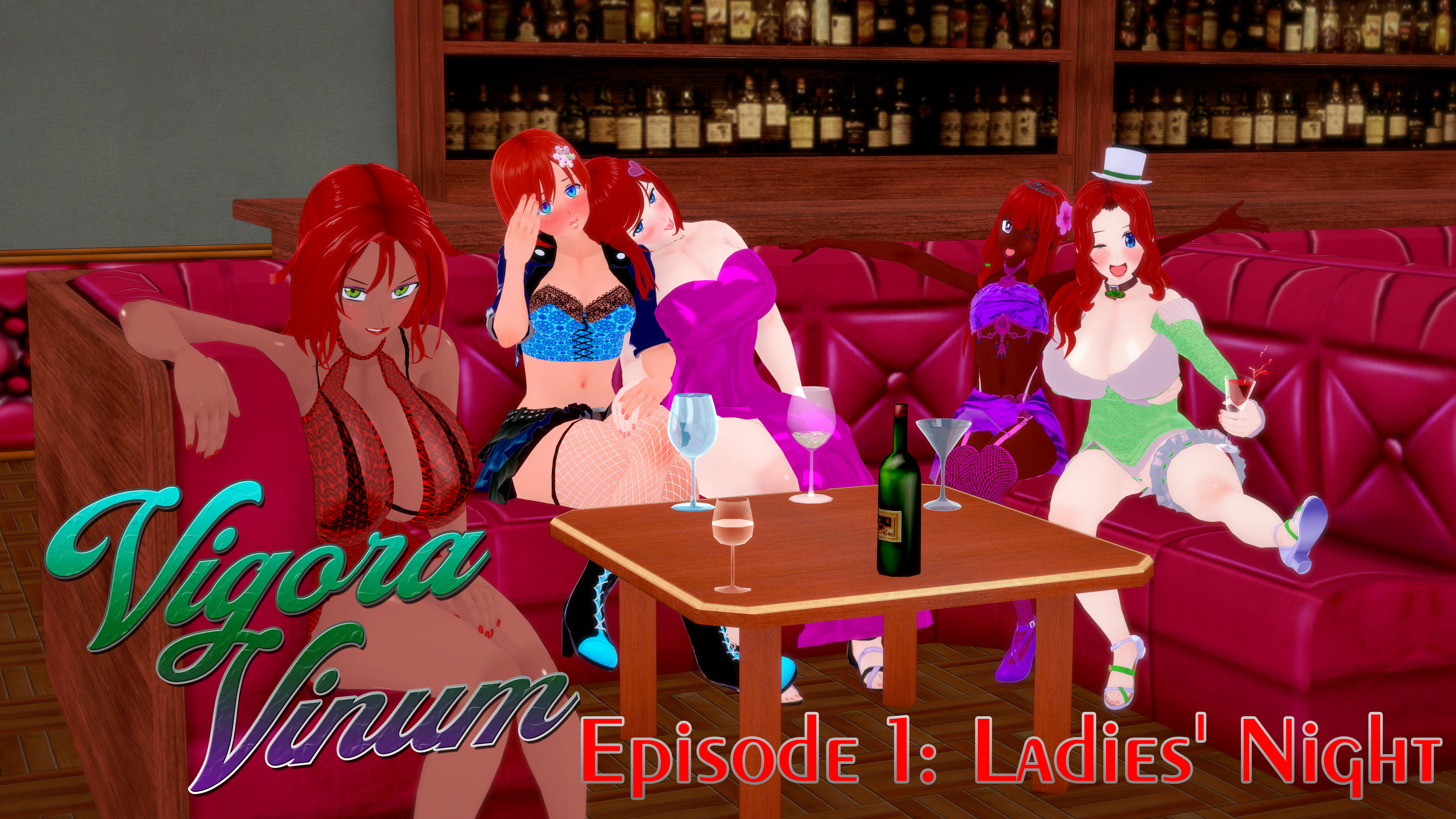
Edited to Add: Here's what the logo looks like in action. As of now, this is my intended cover card for Episode 1. This is also a panel later in the comic, so I'm in debate of designing an original one, with the logo in mind, or just using this for now.
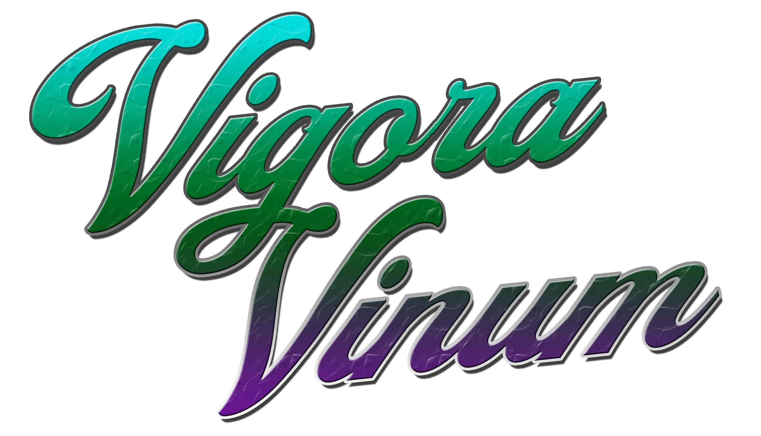
Wanted to design a fancier title for the VigoraVinum series than just using a basic font.
This started with the font "Froadmile", as I wanted something with a cursive adjacent font, but still readable. I noticed the G in Vigora had a tail that extended almost perfectly into the starting curl of the capital V, so I came up with the idea to link the two "words" together in this way, and I like how it turned out. Then I did some basic shape transform and skewing to form the final word design.
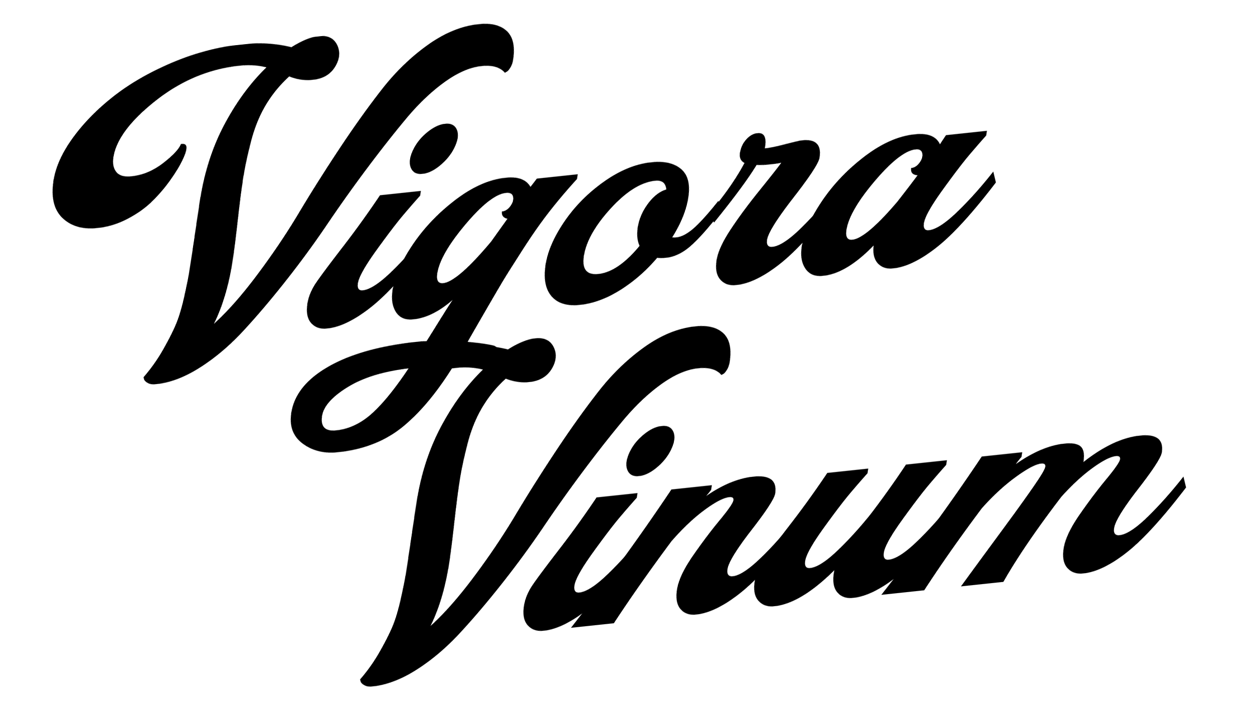
The logos I'm presenting a simple "Letters Only" version, and one where I did tryhard thing of adding different photoshop effects.
I tend to overdesign things, and I know gradients are kinda cringe, but I'm into them and clearly "graphic design is my passion." The color choice is purposeful as it matches the "better matcap" shader in KK, that gives most items a green to blue sheen. I use it in the story on any bottle containing "VigoraVinum" so you know the connection there.
If the above logo is like, "too much" let me know and I'll work on it. If you like it and think it more than serves the purpose of a titlecard for a hentai manga series, also let me know.
Files